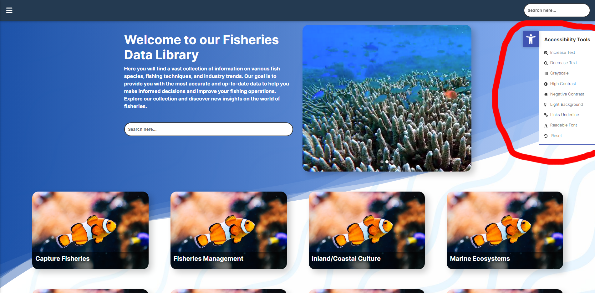
Increase Text
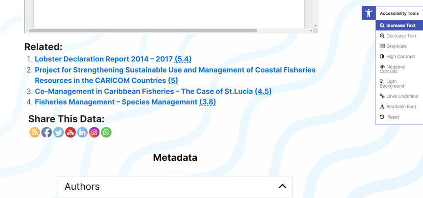
This setting increases the size of body text on the page.
Decrease Text
This setting reverses the text size increase on the page to default size.
Grayscale
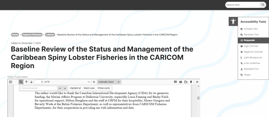
This setting removes all colours on the page, rendering them in black/white/gray. However, it does not affect the background pattern.
High Contrast
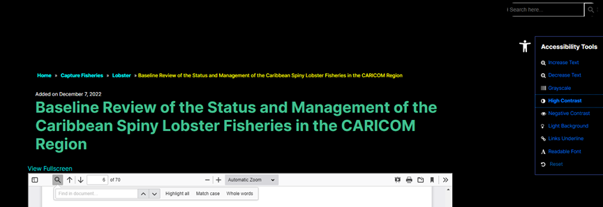
This setting changes the colour palette of the site to maximize contrast. Text will be displayed in bright colours while the backgrounds will be rendered completely black. This setting can make it easier for people with visual impairments to navigate the site.
Negative Contrast
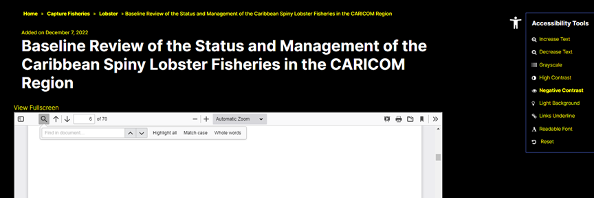
This setting changes the colour palette of the site by rendering titles in white and all other text in yellow. This setting can make it easier for people with visual impairments to navigate and identify the textual context.
Light Background
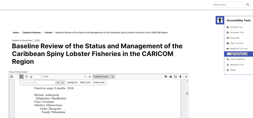
This setting changes the colour palette of the site by rendering all backgrounds in white and all text in black. This setting removes visual distractions and brings focus to the text elements.
Links Underline
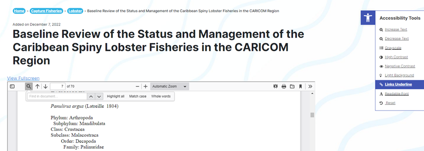
This setting underlines all hyperlinks on the site.
Readable Font

This setting changes the site’s font to one where the individual letters stand out more and makes it more easily readable.
Reset
This resets the page’s visual look to its default setting. Useful for when a user needs to undo visual changes made by toggling the Accessibility Tools.


